Posts

Showing posts from 2016

EarthQuake

Image
Earthquake Start of a project to bring in information from a website with an Application Programming Interface (API). We are going to use a modified version of "Project: Fetching Current Weather Data" from "Automate the boring stuff with Python" by Al Sweigart What is going on below? We import libraries to dela with json, reuest from the server and the pandas library. In [1]: import json , requests import pandas as pd from pandas import json_normalize In this section we creating a string made up of the URL. Requesting the information from the site with the URL we created and pass back the information. Data comes from the US Geological survey  https://www.usgs.gov/about/about-us/who-we-are and one of their earthquake feeds. Then print out what was returned. In [2]: url = 'https://earthquake.usgs.gov/earthquakes/feed/v1.0/summary/all_hour.geojson' response = requests . get ( url ) response . raise_for_status () Now we need load the data which i

Bit of fun - SNA of RI Xmas Lectures part 2

Image
The previous post http://datavizexperiments.blogspot.co.uk/2016/12/bit-of-fun-sna-of-ri-xmas-lectures-part.html  look at a set of tools for playing with the twitter data and the results for #xmaslectures a hashtag associated with the Royal Institution's Christmas Lectures, but for the pre-lecture time and after for the first one.  This post looks at the last lecture. Before the last lecture The last two and half days 26/12/2016 to 2pm 28/12/2016 Using Sociov.net and GEPHI to visualise the tweets. Figure 1 shows peaks when the lectures are broadcast and the sustained rise (as compared to the levels pre-lectures being broadcast levels) in values between the lectures figure 1 Figure 2 Figure two shows the dominance of the two tweeters @ri_science and @siafulchemstry (the host and the presenter respectively). There is another level of nodes/tweeters who are often (but not all) guest presenters within the lectures. After all three lectures (26/12/2016 -28/12/2016)

Bit of fun - SNA of RI Xmas Lectures part 1

Image
From a curiosity point of view I was wondering what the Twitter activity was for The Royal Institution (  ri_science) Christmas Lectures (#xmaslectures) presented by Professor Saiful Islam ( @saifulchemistry) The week before 18th - 25th December Three biggest sources for retweets and mentions are  Most influentials (nr RT/Mentions received) @ri_science 513 @saifulchemistry 245 @bbcfour 117 After the first day (10pm on 26th December) Interesting the National Portrait Galley be came a hub of activity. Repeating the exercise at 9am on the 27th December 2016. Central 'core' of activity with some unconnected links. The 'unconnected' links could be from another use of the hashtag #xmaslectures or tweets that don't mention twitter names of those in the core. A more interactive approach is the use of Martin Hawksey's fantastic tool TAGs (see http://datavizexperiments.blogspot.co.uk/2016/12/social-visualisation-using-tags.html 

Bibliographic Analysis Tools for Computing

Image
In this post, I am looking at a couple of ways to analyse biblographic data.  Starting with the simplest, Word Clouds but then an interesting tool VosViewer . All the data is taken from the University of Northampton's Research Repository - Nectar - for members of the academic Computing team.   Word Clouds The image above is based on data for all the listed publications for the computing team since 2011. It includes the authors, title, conference, etc; but no abstract. It takes quite a bit of editing and really all that is being shown is the Authors name for the most published authors and a few key terms. Provides a nice snap shot but is difficult to interpret. Taking this a bit further, looking at the titles of research outputs per year. Titles 2016 Titles 2015 Titles 2014 Title 2013 Title 2012 Title 2011 The interesting trend is the changing nature of the research in 2011 computer education comes out as a strong feature. In

Social Visualisation using TAGS

Image
In a previous post I discussed using a twitter social analysis tool . In this post I am going to discuss another fantastic tool TAGS. Developed by Martin Hawksey ( @mhawksey ) this is a great free tool for visualising tweets; using a Google  Spreadsheet to be the  front end to link into Google Visualization API. I am not going to go into a description of how to set-up it here; I don't need to the best place to go for this is to follow the link here . In this post, I am mainly going through my (probably bit random) thoughts, an example and experiences with it. So the example was a twitter chat #caschat or #CASchat held on the 13th December 2016. The conversation is between teachers of computing as well as those who support or have an interest in supporting computing in schools.  Figure 1 I find the visualisation of twitter chats interesting; seeing the links between people, groups that form, but also seeing the way people engage.  So I set up the spread

Social Analysis using socioviz

Image
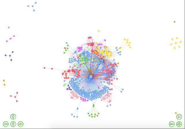
Originally posted in  https://computingnorthampton.blogspot.co.uk/2016/01/mini-projectsocial-network-analysis-fun.html figure 1. #StarWars 30/12/15 Playing with Socioviz ( socioviz.net ) - a free online tool for looking at influence on twitter. The image to left show connections between tweeters using the hashtag #StarWars on the 30th December 2015 up to 6pm (GMT). Figure 2 shows the most active tweeters for this hashtag and the most influential based on Retweets and Mentions - the four greatest influencers are picked out in the video below, showing the map evolving (speed-up 20 times).   figure 2 To experiment with this a bit more  +The Royal Institution   has a long traditional of holding a series of Christmas Lectures  which are now televised, Dr Kevin Fong presented this years. I was curious about who the biggest influencers on twitter were for the hashtag #xmaslectures over the three days of the show. The three biggest influencers came out as  @Kevin_Fong @Ri_Sci

Publications in a social network

Image
The Computing staff's network of co-authors, at the University of Northampton, based on the University's  research repository NECTAR -  http://nectar.northampton.ac.uk/view/divisions/SSTCT.html  on 12th November 2016.  The data goes back to 2010. The data was analysed using the software VOSviewer -  http://www.vosviewer.com/  free software for visualising networks . Differences in colours represents, the clusters of publications with those authors picked out by the software. The relative size of the circles is the relative number of publications listed; so for the two biggest circles/hubs it relates to 55 and 34 publications in this time period. Some relatively new authors, to the University but not to research, explains some of the 'islands' and the number of publications within it - it only reflects publications whilst at the University of Northampton. To dig a little deeper, going to  look at the two biggest 'hubs' through their NECTAR records, so pote